I previously wrote a post about dates not displaying correctly in SmartView and Financial Reporting Studio when using 11.1.1.x (http://whatsallthehype-essbase.blogspot.com/2010/04/date-dimension-display-problem.html). Recently, I have seen a couple of posts about this exact issue on the forums so I thought I would write another post detail one alternative for addressing this issue.
To review, this was identified as a bug by Oracle that was fixed in 11.1.2.x. For those of us that are not yet on that version, this is still an issue. As noted in my previous post, the date is stored correctly, but just being displayed one day less than the date stored. For example: 2/11/2013 displays as 2/10/2013. I had suggested loading the data to one member and then using formulas to display the correct dates.
So to expound upon my previous suggestion, here is how we are going to handle the date display issue.
Let’s say we have an effective date that needs to be stored. We are setting up 2 date measures:
1) Effective_Date – Date type member within account dimension where we will load and store the date
2) Effective Date – Date type member within account dimension where we will perform a calculation to roll the date forward by one day so that the date displayed is correct.
The formula in our Effective Date member utilizes the DateRoll MDX formula. The formula would be:
DateRoll([Hire_Date], DP_DAY, 1)
Now we have our data stored correctly in one member(Effective_Date) and have a member that can be used for reporting purposes (Effective Date). For end users, we will likely set up a filter that provides them no access to Effective_Date so there isn’t confusion as to which date is the correct date. In addition or as an alternative, you can create a small rollup within your account dimension that is for the stored dates. You can even label it as a do not use. It is really preference.
The beauty of this plan is that once we do upgraded to 11.1.2.x, we can remove our Effective Date formulated member and add “Effective Date” as an alias to our Effective_Date member. This will allow the process to be seamless to our users as they almost always use alias table when doing their ad hoc analysis. So having “Effective Date” on one of their retrieves, while pulling a different member, should still return the same results, eliminating the need to update any retrieves where this data was being utilized. Note: If you have applied a filter to limit access to these members then you will just need to remove that filter. If you decide to add a node to “hide” the stored members in prior to upgrade, just remember to move them back into the main hierarchy so users can easily find them.
As a note: The DateRoll function can be used to roll a date backwards or forwards by any part of the date (Year, Quarter, Month, Week, or Day).
Showing posts with label Financial Reporting. Show all posts
Showing posts with label Financial Reporting. Show all posts
Monday, February 11, 2013
Wednesday, August 25, 2010
Hyperion Reports - Axis Labels on Charts
I found several other limitations with axis labels when working with Hyperion Reports and charts. Fortunately, there are work arounds, some better than others.
One issue I found when using charts in Hyperion reports is that if you have more than one dimension on a column or row, both are used in the axis labels on the chart. There is a simple solution for this.
For example, in a rolling monthly report there will likely be both Fiscal Year and Accounting Period on the columns, but for the chart only months should be displayed.
To accommodate this, the solution is to put a custom heading that is blank on each of the Fiscal Year cells within the grid. This will exclude the heading on the axis label in the grid. If both the grid and graph are to be shown and the year still needs to appear within the grid, a custom heading can be used on the Accounting Period. Using text functions in the custom heading, the Fiscal Year and Accounting Period can be referenced in the same heading accomplishing the intended results.
Another issue is that in some instances the last Y axis label is being cut off. To work around this, add a secondary axis. This defaults to 0 at the bottom and 100 at the top, with no other steps in between. Formatting the font on the secondary access to be white or whatever the report background color is hides the secondary axis, but gives the last Y axis label a little more room.
Finally, the last issue I had is with the chart axis label being in whole numbers and not decimals. From all of my research I found that the axis label should follow the formatting of the grid, but it is a known issue that it does not. There were several posts on the forum about a non-Oracle approved solution and to use at your own risk. Since this one wasn't my solution, nor is it Oracle supported, I will simply post the link to the forum post and say it did work. I do however find it amazing the only work around is to adjust the XML.
http://forums.oracle.com/forums/thread.jspa?messageID=4039265?
Friday, May 21, 2010
Ranking Reports
Hyperion Financial Reporting Studio lets you create ranking reports easily by using the built in functionality, but it is available only when there is one dimension on the row. It is also only available for ranking the Top n number of dimensions and not available for the Bottom n number of dimensions. What happens when you want to have more than one dimension on the row or want to rank the Bottom members of a dimension gets more complicated.
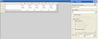
 To show the Top 5 products from this list, select row 1 and apply suppression to an row where Column F is > a value of 5. Also, select suppression for where Column F is equal to Zero or No Data. Additionally, using the Grid Properties pane, apply a sort to Row 1 using Column F in ascending order. The column containing the rank can be hidden on the final report.
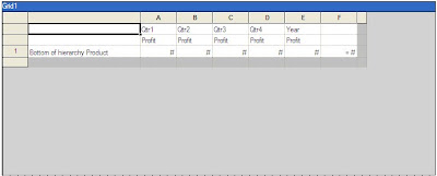
Using the built in functionality we can create a report of our top 5 products. The product can be put on the row with quarterly and total year Profit on the columns. By highlighting the row, the ability to select the Top n results based upon a column selection becomes available in the Properties pane on the right. The resulting report, shows the top 5 products by year and sorts them in descending order.
There is also a Rank() formula that can be used. This works around both of the drawbacks of the built in Ranking functionality. It allows you to sort ascending or descending. It also allows you to rank members when there is more than one dimension on the row. It will rank based upon the rightmost dimension on the row.
The syntax for the formula is Rank([Reference], Order, Unique(optional)). The Reference can be a cell, row, or column. Order for ascending can be specified as Ascending, Asc, or 1. The order for descending can be specified as Descending, Des, Desc, or 0. Unique is used to indicate how to treat equal values where false gives equal values the same ranking and true gives each value a unique ranking and there is no duplication.
The following achieves the same ranking as above when using the formula Rank([E, 1], Descending ,true). This formula ranks each line but does not filter the results. The ranking for each product can be found in Column F.
To show the Top 5 products from this list, select row 1 and apply suppression to an row where Column F is > a value of 5. Also, select suppression for where Column F is equal to Zero or No Data. Additionally, using the Grid Properties pane, apply a sort to Row 1 using Column F in ascending order. The column containing the rank can be hidden on the final report.Alternatively, a Bottom 5 products report could be created by changing the formula to be Rank([E, 1], Ascending ,true).
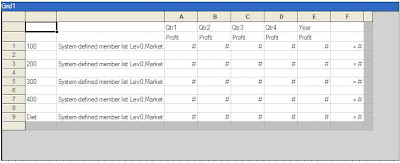
Applying all of the same row and report properties as above, here is an example of a report that lists the top 5 markets for each product line.
If there is a need to create a report with both the Top 5 and Bottom 5 members in one report, an additional row can be created for each of the rows. One row will have the rank formula ascending and one will have the formula descending. Additional sorting can be added to the descending rows to have the entire column sorted in order.
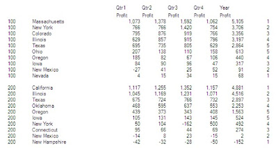
An excerpt of the resulting report would be as follows.
 The next hurdle is what happens if there are less than 10 markets with data. This will cause duplication in rows on the report, which is not the desired result.
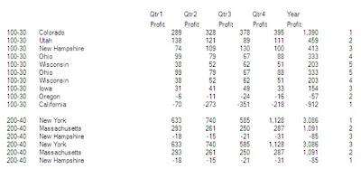 In this example, Ohio and Wisconsin are duplicated for 100-30 since there are only 8 Markets for this product line with data. All 3 markets are duplicated for 200-40, because there are only 3 markets populated.
To work around this duplication issue a Max formula can be used on one of the ranking rows and then suppression can be built on the second that utilizes this Max formula.
In the example, insert a formula row for Row 3. In Column F, specify the formula as Max([2]). Change the Row 2 suppression to exclude the entire row if the Max is less than or equal to 5 and specify to exclude the larger rankings for each of the instances where there between 6 and 9 members in the grouping. The suppression for Row 2 in the sample report would be:
- Data Values in Column F > Value of 5 Or
- Data Values in Column F = Zero Or
- Data Values in Column F = No Data Or
- Value in Cell F,3 <= Value of 5 Or
- ( Value in Cell F, 3 = Value of 6 And
- Data Values in Column F = 5 ) Or
- ( Value in Cell F, 3 = Value of 7 And
- Data Values in Column F = 4 Or
- Data Values in Column F = 5 ) Or
- ( Value in Cell F, 3 = Value of 8 And
- Data Values in Column F = 3 Or
- Data Values in Column F = 4 Or
- Data Values in Column F = 5 ) Or
- ( Value in Cell F, 3 = Value of 9 And
- Data Values in Column F = 2 Or
- Data Values in Column F = 3 Or
- Data Values in Column F = 4 Or
- Data Values in Column F = 5 )
The resulting report will then look exclude the duplications.
Subscribe to:
Posts (Atom)